
Inspired by Difference
SELECTED WORK
Different problems.
Different solutions.
Designed with purpose.
SUNRISE CLEAN CARE
Building a brand people can trust.
BRAND IDENTITY • PRINT • PHOTOGRAPHY • MARKETING • VIDEO
THE CHALLENGE
A trusted local company needed its marketing to reflect the quality of its service.
Sunrise Clean Care had years of experience and a strong reputation, but its visual communication needed greater consistency and a more personal connection with customers.
The goal was not simply to make things look better. It was to create a recognizable marketing presence that communicated trust, professionalism, and the people behind the business across print, vehicles, photography, and digital media.
THE IDENTITY
The transformation started with a new visual identity.
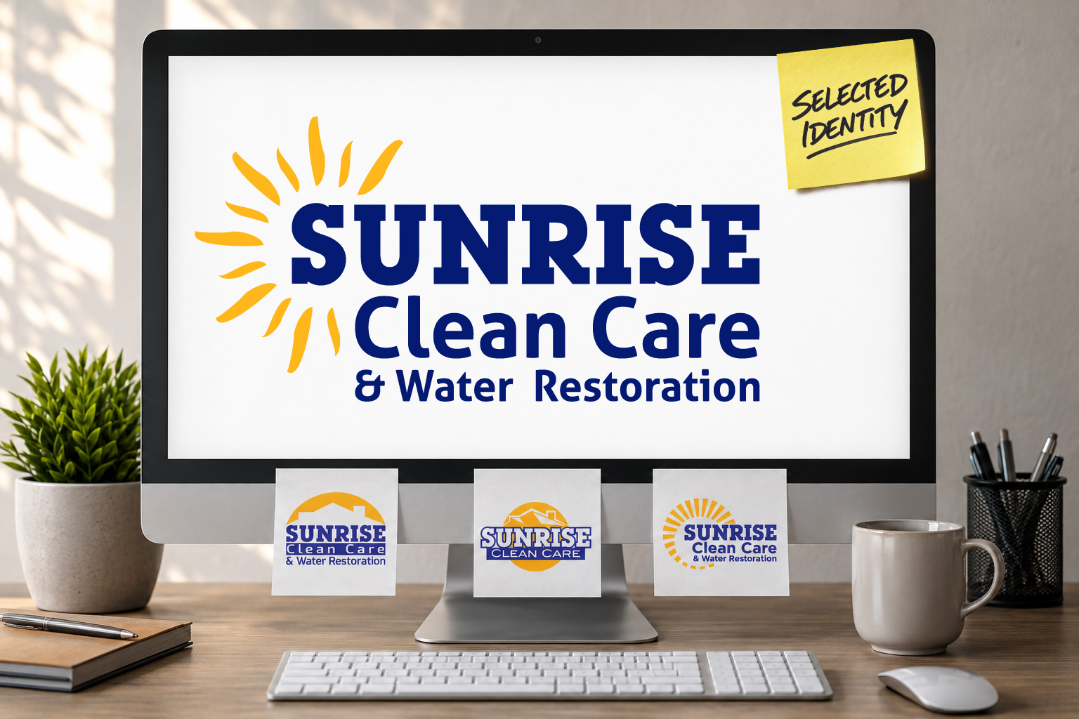
I developed several logo directions for Sunrise Clean Care, exploring different ways to create a stronger, more recognizable identity.
Rather than presenting the logos in isolation, I showed how each direction could work across real-world applications, including uniforms, vehicles, business materials, and promotional items.
The selected identity became the foundation for everything that followed.

THE APPLICATION
The new identity moved beyond the logo and into every customer touchpoint.
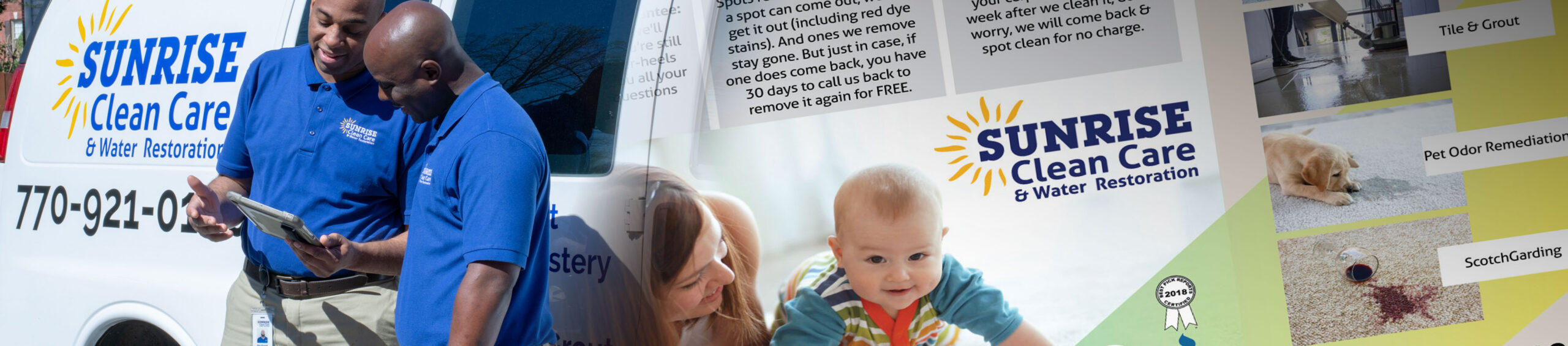
With the identity established, I developed a consistent visual direction across Sunrise Clean Care’s marketing.
The new brand was applied to vehicles, uniforms, printed materials, promotional pieces, and digital communications, creating a more unified and recognizable presence.
The goal was consistency without losing personality. Each application needed to feel unmistakably Sunrise while still working for its specific purpose and audience.
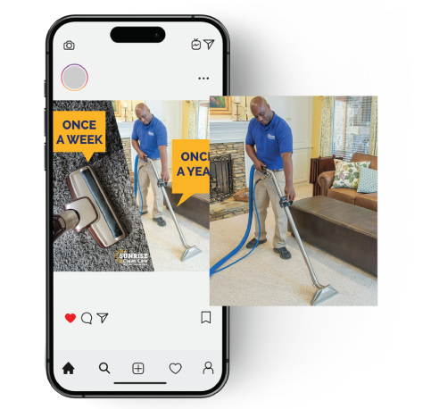
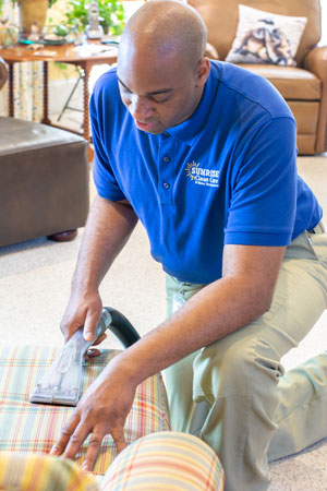
Professional photography became an important part of that system. Rather than relying entirely on stock imagery, I recommended featuring the actual Sunrise team, giving the brand a more authentic and personal connection with customers.
THE MARKETING
Bringing the identity, photography, and message together.


THE FLEET
Taking the new identity out into the community.
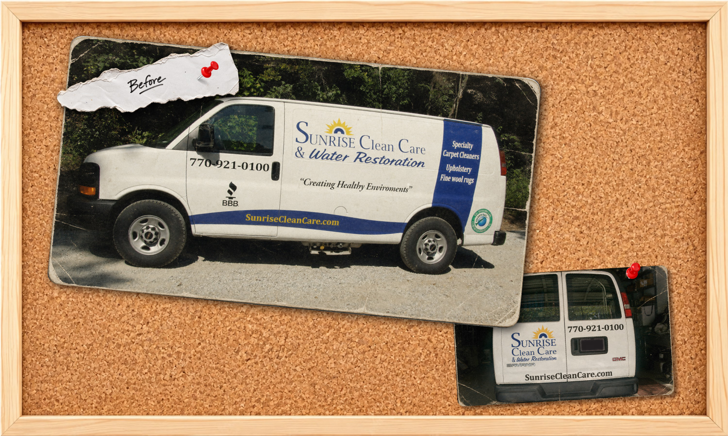
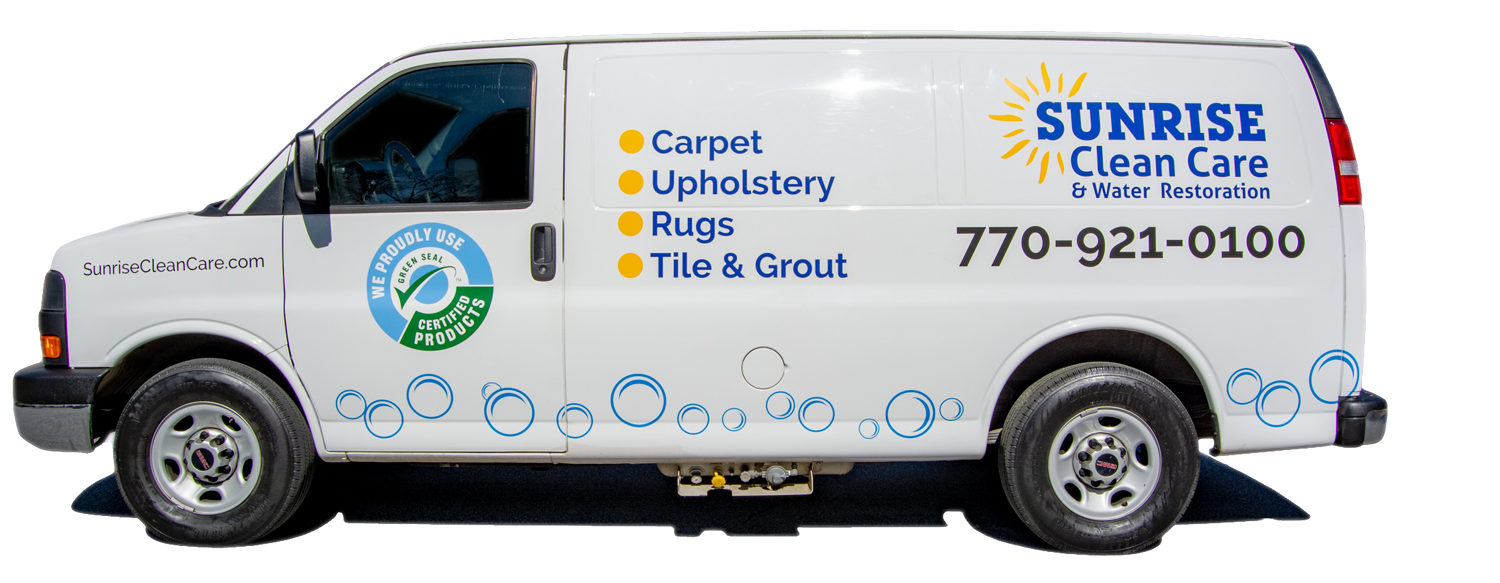
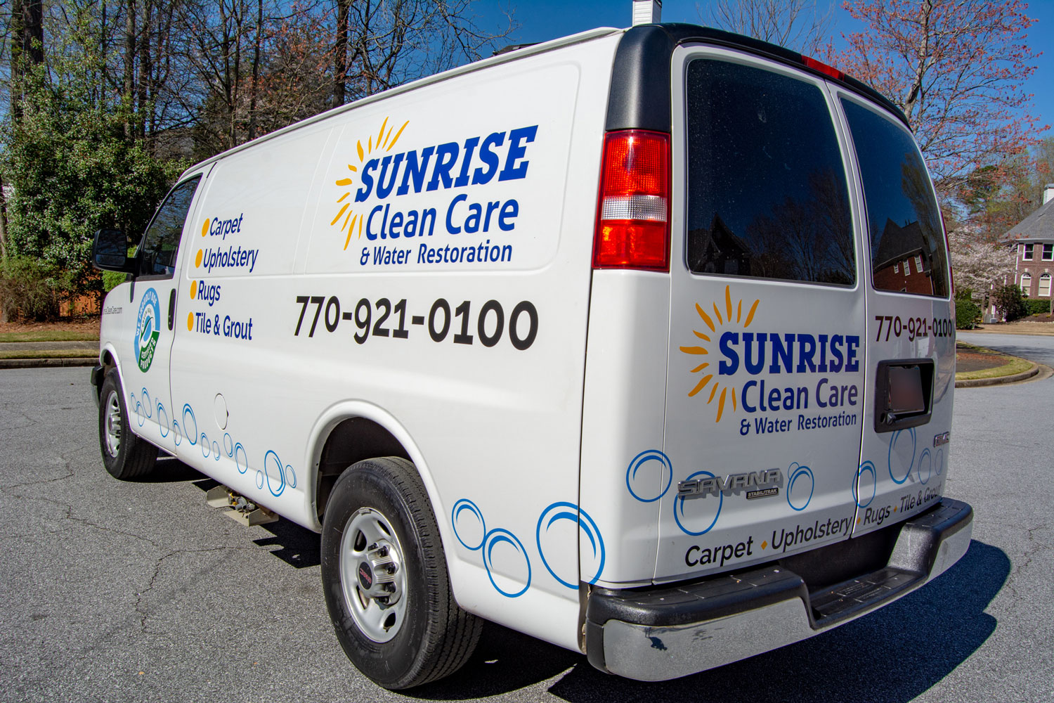
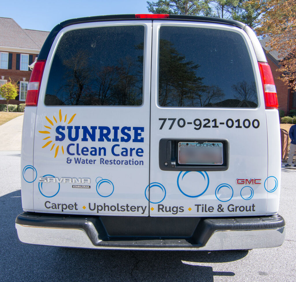
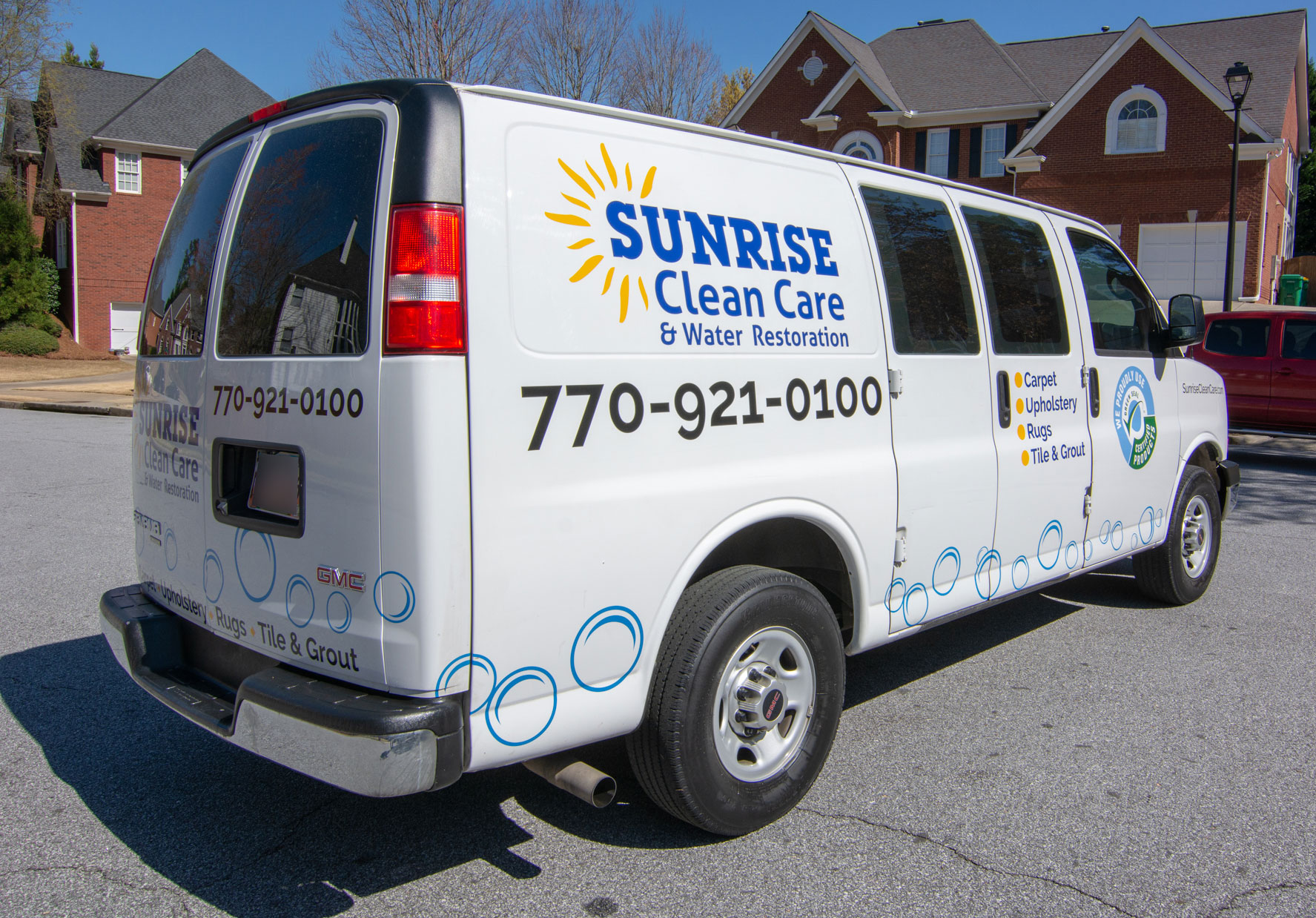
Sunrise Clean Care’s service van presented one of the most visible opportunities to put the new identity to work.
I developed the vehicle graphics to create strong brand recognition while keeping the company’s services and contact information clear and easy to understand.
Every element had to work at a glance, whether the van was parked at a customer’s home or moving through traffic. The identity, color, messaging, and graphics were designed to create a professional presence that was unmistakably Sunrise.
The service vehicle became more than transportation. It became a moving advertisement for the brand.
THE RESULT
A stronger identity built around the people behind the business.
What began as a logo redesign developed into a complete visual system for Sunrise Clean Care.
Across photography, print, digital communication, uniforms, and vehicle graphics, the new identity gave the company a more consistent and recognizable presence while preserving the personal character of a trusted local business.
Each element was designed to work individually, but more importantly, to work together, creating a brand customers could recognize whether they encountered Sunrise online, in print, or in their neighborhood.
The result was not simply a new look. It was a more unified way for Sunrise Clean Care to present who they were and the quality of service they provided.